Meraai
Freelance project - 2022

Meraai is a B2B trade platform for SMEs. It brings together traders, wholesalers, retailers, and manufacturers on a single platform to provide access to far-off markets and credit.
Role
Freelancer, UI designer
Scope
2 weeks, June 2022
Tools
Figma, Balsamiq
Maintaining and tracking information about vendors, sellers, and purchase orders as well as facilitating the finance aspect around the same, can take time and effort while using an excel sheet.
A well-organised web portal that can automate the process of storing all the various data related to business deals and transactions will not only save time but also get around accessibility issues.
Design Process
For this project, I had a limited timeframe of two weeks to complete a project. As a result, I decided to follow a specific design process that involves three main stages: Define, Ideate, and Prototype.
Define
User Persona
I developed a primary user persona demonstrating our target users’ goals and pain points, which helped me prioritize design decisions. I used the information gathered in the persona to create a solution that solves the most pressing problems for the user.
User Flow
To create the user flow, I combined all the steps discussed with the stakeholders during the design process. This included insights gathered from user research, feedback from stakeholders, and an understanding of the product goals.
The user flow would outlined the user's path through the solution, including the different screens, actions, and decisions that the user needs to make. It also identified the pain points, bottlenecks, and areas of friction that the user may encounter along the way.
Ideate
Sketch
I used a brainstorming approach to generate ideas for the product or service design. I did this by sketching a basic layout for all the screens, which served as a visual representation of my ideas. The sketches included rough drawings of the different screens and components of the solution, such as the home screen, menu options, forms, and other user interface elements. The goal of sketching the basic layout was to capture all of the ideas that I had for the solution, without worrying about the details.
Lo-fi wireframes
I created low-fidelity wireframes in Balsamiq to communicate their vision for the user interface to stakeholders. The wireframes provided a basic representation of the design concepts and helped to illustrate the layout, structure, and functionality of the solution. This provided a clear starting point for more detailed design work, saving time and resources in the long run.
Prototype
Visual Design
#A95013 (Burnt Sienna): This earthy, deep orange-brown tone conveys a sense of robustness and reliability.
#F69620 (Bright Orange): This vivid, energetic orange is more contemporary and suggests innovation and affordability.
#2B353E (Gunmetal): A dark, muted blue-gray, symbolizes professionalism and sophistication.
#DFDFD (Off-White): This near-white shade provides a clean, minimalistic backdrop that enhances readability and suggests simplicity and ease of use, which is essential for user interfaces.
These colours together balance warmth and coolness, mirroring the diversity of businesses that the company aims to unite.
Hi-fi Wireframes
Authentication Page
I implemented an authentication process that relies on the user's email address to generate a one-time password (OTP) for account access and verification. Unlike traditional authentication processes that require the user to remember and enter a password, this approach eliminated the need for password verification and instead relied on a unique OTP that is generated each time the user logs in.
By omitting the password verification step, I was able to further streamline the authentication process and eliminate the "forgot password" option, which can be a source of frustration for users who have trouble remembering their passwords. Instead, the user can easily access their account by entering the OTP generated by the system, which provides a seamless and efficient user experience.
Admin Dashboard
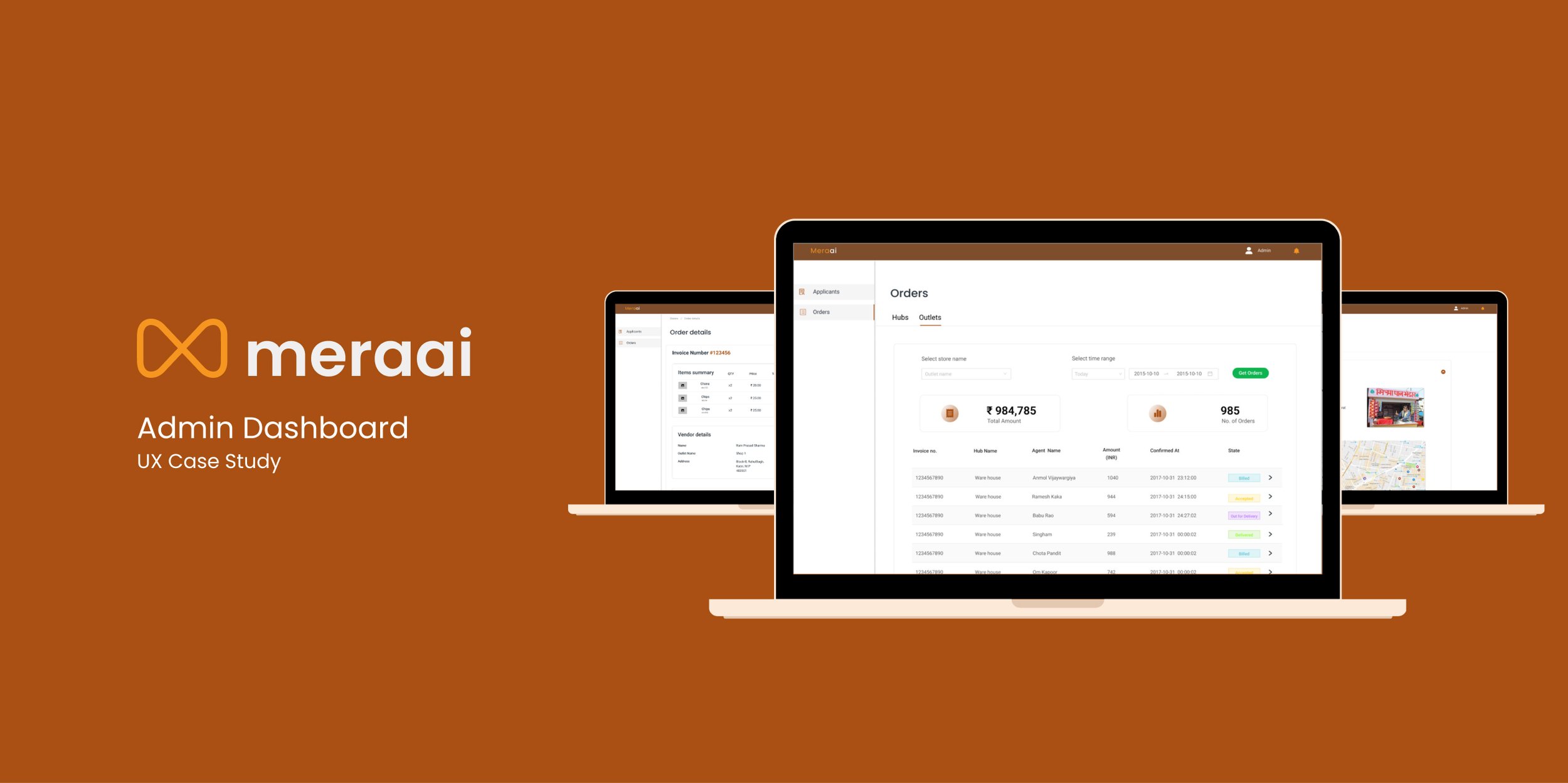
A dashboard for administrators that allows them to view the status of each applicant who has submitted an application through the portal. By accessing the dashboard, the administrator can select a specific applicant and view all of their relevant information, including store, owner, and bank details.
The benefit of this approach is that it provides the administrator with a centralized location to manage and track all applicants, ensuring a more efficient and streamlined onboarding process. By providing easy access to applicant information, the dashboard enables the administrator to make informed decisions about each applicant and determine whether to onboard or reject them based on the overall assessment.
Orders page
This allows administrators to track the status of all applicants who have submitted their applications through the portal. By using this dashboard, administrators can easily select a particular applicant and view all of their information related to the application process.
The admin is provided with a detailed report of the items ordered, the hub from which they were ordered, the vendor's details, payment details, and a status tracker in the details section. The admin may accept or reject the order depending on the product's availability and the vendor's reputation.
Impact
Aided in the early stages of operations scaling. Before creating the dashboard, operations were restricted to generating a monthly revenue of 2,00,000 INR, which was becoming increasingly difficult to track on Excel. The business is now making 17,00,000 INR per month, and this dashboard has greatly streamlined many processes.
Key Learnings
In my process, I discovered the importance of clarification and validation and how it streamlined the entire project. Since it was a freelance project for my brother, I had the opportunity to be explicit about every step I took, which helped to avoid making assumptions and mistakes.
Since this was my first project, I started sketching even before I had a clear idea of the user flow's architecture. I ran into a problem with the organisation very quickly. It's simple to lose sight of how each state and screen interact and how one state influences another. I found solace when I took a step back, designed a user flow, and then continued.


